
I've always loved saturated colors, and my hand-dyes reflect that. So, I decided to try some more toned colors. I also need to expand my value range. Hopefully, what I did this weekend will be a start at accomplishing both tasks.
So here's the results. Two violets, one a simple value gradation, and the other a value gradation-color modulation. Katy Widger's small book "The New Color Wheel Fabric Dyeing" has more good information packed between its covers than most dyeing books twice its size. It also has some of the most interesting dyeing ideas I've encountered anywhere. The value gradation/color modulation is one of them. In this, the amount of violet (actually, light red and cobalt blue) is constant in every piece. What changes is how dilute the solution is, and how much gray is added. In the lightest piece, there is only a whisper of gray, and the solution is diluted by about 50% with water. By the time you get to the darkest piece, there is four times as much gray as red/blue, and the dye solution is full strength. I like the toning effect it has, although it is not as obvious with the violet as it is with others.
 I also prefer the mottled look when I dye, not solids- which also can make it more difficult to discern value differences. I did get some awesome mottling on many of the pieces, they will read like a print in a quilt.
Next I did a simple value gradation of the charcoal gray, and a value gradation/color modulation of fire red and charcoal gray. I've never used the gray dye before, and wanted to see what it does alone.

I think I will do another value gradation of the red, with gray added as a constant. In other words, mix the red and gray dyes at the beginning, and dilute it in steps. That will give me tones across the value spectrum, instead of just at the darker end.
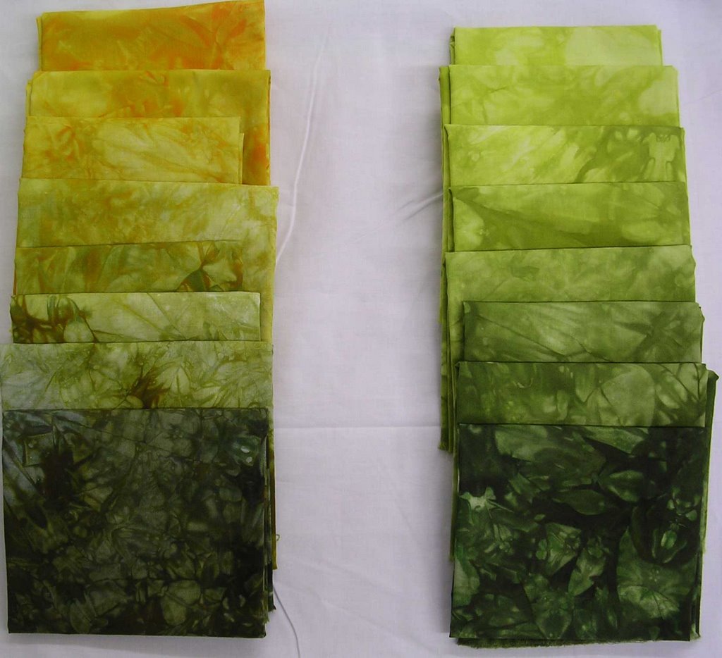
And, finally, my favorites. I did value gradations/color modulation with lemon yellow and gray, and then with golden yellow and gray. I love the greens I got, even more so than the greens I've made with two primaries. And the mottling on these was spectacular, these small portions of the fabrics don't do them justice.
I think I will be doing more dyeing next weekend, maybe the sequenced overdyeing I love so much. There are several I haven't done that will give me the toned colors I'm looking for, like red-violet to blue-green.
Now it's back to postcards. I have to get these off to Virginia this week. And the deadline for my journal quilts is looming- I think my last weed will look a little different than the ones I've done thus far. Maybe use some of these hand-dyes. . .
2 comments:
Beverly, your gradations are great. I especially like the gray and your textures are good. And, of course, chartreuse is one of my favorite colors, so I particularly like that one!
I love the lime gradations - I want some!
Post a Comment